This task really helped me to find inspiration and it actually was one of the factors that made us change our genre to something not as dark.
Timeline of Shallow Grave Opening
0-17 Seconds: Titles introducing Film Four. Simple red background.


18 Seconds: A man with a Scottish accent (protagonist?) starts talking but background is still red.
19 Seconds: It switches to a plain white background.
23-40 Seconds: Confusing close up shot of a man. We can assume the voice is his?

40-45 Seconds: The music starts which is instrumental and very upbeat, at this moment we are confused about the genre. There is a shot of a road.
45 Seconds: There is a shot of a street which presumably has been sped up to confuse viewers, in addition to the music, it doesn't really give the audience a chance to think.

54 Seconds: Just a shot of the road when the first title is introduced. It is a simple, Sans Serif font which is white and bold. There are no capitals. The order is, the production companies and then the name of the actors.

1.04-1.10 Seconds: A shot in a forest. The title shot in the forest is established which is in red and stands out.

1.10 Seconds: Back to city road shot.
120 Seconds: Back to the forest which makes the audience wonder what the significance of the forest actually is.
126 Seconds: Another road city shot.
140 Seconds: Shot inside a house of a man going up a spiral staircase. Looks confusing.

The opening sequence establishes the three main settings: the city, the forest and inside this house. The genre is unclear but we can presume it is a psychological kind of thing by the type of shots but also something more upbeat due to the music.
Title Fonts
We looked at some films that are similar to our film to see what types of fonts their titles used, what colours they used, etc. This will help us massively when deciding what to make our titles look like.
...
Jacobs Ladder
This title is big and bold, the producers name and actors etc are bold and capitalised. The main title is a glowing blue colour with shadowed, lighter, ghostly text behind it. This has a kind of eerie feel to it. The title is positioned at the top of film cover, as it is at the top, it has created a main focus of the cover. The first thing to look at would be the title and from that people could get ideas of what the film could be about. All the actors presented on the cover are right at the top, above the film title and all bold an capitalised.

Black Swan
This title is at the bottom of the film cover. It is black, bold and capitalised. The names of the actors are above the title with their first names in lower case and their last names bold and in upper case. The black title is against a white background, this creates contrast which therefore makes the title stand out even more.

Memento
Memento includes a series of polaroid images including the same picture in each one. The title is written in quite scruffy, childish writing. On the second polaroid there is a quote: "some memories are best forgotten". This line draws people in and makes then wonder what memory is trying to be forgotten and why its so bad. Each actors name is capitalised, however not bold. The title is Black, old and also capitalised to make it stand out.

The Butterfly Effect
The bluey-green colour on the front of this film makes the film look like a sci-fi. The actors names are in blocks around the cover to make a large rectangle. The title is red which almost makes it look like a detective kind of genre. The title starts off small and increases in size towards the middle of the text, then decreasing again towards the end. It also becomes bolder and larger towards the middle . This makes the title stand out. This is good when trying to catch peoples eyes.

Mr Brooks
The title for the film Mr Brooks is bold, white and capitalised. It is in the same position as the Black Swans title, the image has a man showing both sides of his personality by taking part of his face away, seeing what's really underneath. This would relate to our film as the man in our film is schizophrenic and therefore has a split personality. The actors names are positioned above the title, first names in lower case and last names capitalised.
Primal Fear
The letters on this cover are quite spaced out, this would make people pay more attention to the title as they would have to concentrate more to put the letters together to figure out the word, it could look quite confusing if the letters are spaced out. This film cover also has white writing against a dark background, this creates contrast and makes the title stand out more.
...
Jacobs Ladder
This title is big and bold, the producers name and actors etc are bold and capitalised. The main title is a glowing blue colour with shadowed, lighter, ghostly text behind it. This has a kind of eerie feel to it. The title is positioned at the top of film cover, as it is at the top, it has created a main focus of the cover. The first thing to look at would be the title and from that people could get ideas of what the film could be about. All the actors presented on the cover are right at the top, above the film title and all bold an capitalised.
Black Swan
This title is at the bottom of the film cover. It is black, bold and capitalised. The names of the actors are above the title with their first names in lower case and their last names bold and in upper case. The black title is against a white background, this creates contrast which therefore makes the title stand out even more.
Memento
Memento includes a series of polaroid images including the same picture in each one. The title is written in quite scruffy, childish writing. On the second polaroid there is a quote: "some memories are best forgotten". This line draws people in and makes then wonder what memory is trying to be forgotten and why its so bad. Each actors name is capitalised, however not bold. The title is Black, old and also capitalised to make it stand out.
The Butterfly Effect
The bluey-green colour on the front of this film makes the film look like a sci-fi. The actors names are in blocks around the cover to make a large rectangle. The title is red which almost makes it look like a detective kind of genre. The title starts off small and increases in size towards the middle of the text, then decreasing again towards the end. It also becomes bolder and larger towards the middle . This makes the title stand out. This is good when trying to catch peoples eyes.
Mr Brooks
The title for the film Mr Brooks is bold, white and capitalised. It is in the same position as the Black Swans title, the image has a man showing both sides of his personality by taking part of his face away, seeing what's really underneath. This would relate to our film as the man in our film is schizophrenic and therefore has a split personality. The actors names are positioned above the title, first names in lower case and last names capitalised.
Primal Fear
The letters on this cover are quite spaced out, this would make people pay more attention to the title as they would have to concentrate more to put the letters together to figure out the word, it could look quite confusing if the letters are spaced out. This film cover also has white writing against a dark background, this creates contrast and makes the title stand out more.
Film Pitch Re-Do
After receiving feedback on our original feedback which wasn't negative but people were unsure of the genre as we were not aiming for a thriller, we decided that we should change. Looking at other split personality films we found that they were not dark and depressing and that they were more dark comedies.
Below is a re-do of the original film pitch.
Below is a re-do of the original film pitch.
Feedback from Film Pitch
Many of the comments we received were positive ones and are shown below:


Many people commented on our good editing ideas which is something that we thought would be popular and lots of people also said that we were united in our ideas about the film which is good as everyone needs to be on board and like the idea in order for it to be successful.
Some however said that the genre was a bit confusing which we, as a group, have taken into serious consideration as this is not a problem that we want to keep. From presenting our idea to the class we learnt a lot that people didn't comment on, for example, that we needed to take into consideration the target audience more and be more specific, not just saying 'adults' so this is something we discussed and sorted out. We also came to the conclusion that we needed to cut out some of the scenes we wanted to film as it could make us rush and therefore not produce a high-quality opening sequence. We decided to focus on just two locations instead of three, reducing the dialogue and focusing more on the effects and titles.
Possible Name Ideas
We wanted to keep it simple and then put it in Latin to make it more interesting and intriguing.
First idea: Dimidium (Half). This sounds good but the English translation isn't really relevant.
Second idea: Imperium (Control).
The English translation is relevant as it is about the fight for control between the two personalities and the Latin sounds like an English word which people will link to powerful. After thinking about the Imperium name and asking people what they thought, they suggested that it sounds more like a Roman-style film and not the kind of thing we are aiming for.
Third idea: Darker Half
This name is quite powerful in my opinion as it doesn't give away what the film is about too much but indicates the dark, psychological drama genre we are aiming for and sets the tone well. I think if someone asked if I wanted to see a film named 'Darker Half' I would be intrigued as to what it was about.
Group Film Pitch
Film pitch from oliviaseymour
This is mine and my group's first idea for our opening sequence, we will present this to our class and they will then feedback on if they think it is good enough.
More Film Opening Ideas
I am really keen on trying to make the 1940's style film work as I think it is quite original.
Individual Film Pitch
Individual film pitch from oliviaseymour
This is my individual idea for the Film Opening. We will discuss in groups on the 10/11/2014 about who's idea would be the most suitable for the task and then we will plan and do another film pitch for the real seqeunce.
I think this idea would be good but the genre could potentially be confusing.
This is my individual idea for the Film Opening. We will discuss in groups on the 10/11/2014 about who's idea would be the most suitable for the task and then we will plan and do another film pitch for the real seqeunce.
I think this idea would be good but the genre could potentially be confusing.
Extra Student Film Opening Analysis
These are other film openings that we were asked to go away and find on our own. I found it interesting seeing all the different and vast amounts of ideas that people had came up with.
Growing Pains
WHAT I LIKE:
I think the camera shots are very good, especially the one with the skateboard and it helps to build up tension. I like how it switches from the two girls and back to the boy until eventually the girl and boy both meet as I think that is a very clever idea. The music appears relevant to the genre.
WHAT THEY COULD HAVE IMPROVED?
At first it leads you to believe that this is some kind of Teen Drama because of the music and how they're speaking, However at the end it seems like it may be more of a Romantic film so I think perhaps they should have made the genre a bit clearer. The sound also needed to be more clear in my opinion as at times it was actually hard to hear what the girls were saying.
GRADE/MARK I WOULD GIVE:
I think this deserves a low level four as the editing and camera shots are excellent and the titles are done well. The Mise en Scene is also well thought out as it is set in a typical London town with the high-rise flats and bus stops, which is how teenagers are generally represented. The editing with the girls and then going to the boy is clever and helps to build more of an atmosphere. The only criticism is perhaps working on the sound.
Pulled From The Rough
WHAT I LIKE:
I really liked the story-line in this opening sequence as it does leave you wondering lots of things but at the same time it isn't confusing. I liked the setting and the characters personalities that were portrayed. I also thought that considering this is supposed to be a very serious film, the acting was superb as I can imagine you would get the giggles a lot trying to act out something like this. I liked the music in the background as it made it seem more like an opening then just a clip from a film.
WHAT THEY COULD HAVE IMPROVED:
Some of the camera shots could have been improved as sometimes they cut off parts of the boy in a way that looked unnatural and I also think they broke the 180 degree rule about half way through the sequence which looks confusing. The titles could have been more imaginative.
GRADE/MARK I WOULD GIVE:
I would say this is definitely in Level Four as the acting is brilliant and the Mise en Scene is good. The setting and the props is well thought out, a messy bedroom with lots of alcohol bottles which leaves the audience with an idea of what this girl has been up to (drinking, lounging around, etc) but doesn't give a reason as to why she is behaving in this way which makes the film a lot more intriguing for the audience. The only thing I would say when it comes to editing is to be wary of the shots and frames and also making sure the sound is clear.
Raiders:
WHAT I LIKE:
Some of the shots are done well, especially the beginning one with the shoes walking up the steps and when they are running as it makes it seem more tense. I also liked the music choice as it was relevant to the genre.
WHAT THEY COULD HAVE DONE BETTER:
The sound at the beginning of this film is not very clear and you can hear the wind a lot, they should have maybe considered re-recording that bit of sound. There are also a limited amount of titles, the ones that are there are done well but it would have been nice to see some more. One of my biggest criticisms would be that the special effects are not realistic at all, there is no blood when the first boy is shot and the explosions coming out of the guns look cartoon. When another person is shot and blood is visible, the blood is cartoon also. In addition, the guns look like children's toys which makes the film seem more comical than serious which I presume isn't what they were aiming for. It also seems more like a short film as at the end it seems like they have achieved their aim, finding whatever was in that locker. The only question I have at the end is what was actually inside but apart from that everything else is answered already.
GRADE/MARK I WOULD GIVE:
I think this would have achieved low/middle level three as the genre is quite evident by the use of the music and the guns (even if they aren't very realistic). However the Mise en Scene, such as the setting, at a school during the day. There would not only be a few students if it were during the day and it is very unlikely that they would kill people for an item hidden in a students locker. The props were not very well thought out, for example the gun. The special effects needed to be improved massively.

Student Film Analysis
This is my analysis of three film openings. Looking at these openings have really helped me in deciding what I should/shouldn't do when it comes to me doing my own opening sequence so overall this has been a really beneficial task.
Number One:
Michael WHAT I LIKE:
I like the originality of the story-line, with the boy getting his heartbroken when it is usually the girl. Whilst adding a twist to the stereotype of this genre, the genre is still very evident with conventions such as sad-guitar music and the broken biscuits. The talking is very clear and the acting is realistic, especially with the break-up at the beginning. One thing in particular that stands out to me is the transitions when the boy is in his bedroom, this represents the amount of time that he has spent grieving without anything telling you which is extremely clever in my opinion.
WHAT THEY COULD HAVE IMPROVED:
I don't think there is much that they could have improved on, apart from maybe the boy running off crying at the beginning. However it depends if this film is going to develop into a Rom-Com or just a romantic film. They could have used more settings but overall this is a high-quality, well thought-out opening sequence.
GRADE/MARK I WOULD GIVE:
I would give this a high level four (Grade A) as I think the narrative and representations are well thought-out, steering away from the stereotypical romance films with girls getting their heartbroken. The camera shots are impressive and the sound is very clear. The Mise en Scene is very good, including the boys bedroom, the props such as the guitar and the biscuits and the music.
Number 2:
Roses Are Red
WHAT I LIKE:
The conventions are there at the beginning for it being a typical girly film, helped by the music and the use of the makeup. The titles are also extremely impressive as they have been very creative about them, for example the Polaroids and on the socks. The camera shots are also good.
WHAT THEY COULD HAVE IMPROVED:
My criticisms of this sequence would be that it is mainly filmed in the girls bedroom which could be boring for the audience to watch. There is also a confusion with what genre this film actually is right at the end of the opening with the voice-over which not only sounds creepy but suggests this film is going to be about some kind of boy problem which is not indicated at all earlier on.
GRADE/MARK I WOULD GIVE:
I think this would have achieved high level three/low level four (grade B?) as the titles are very good and the conventions for the genre are all included at the beginning. The shots are impressive and it is well thought out. The Mise en Scene is good such as the use of the really girly bedroom which helps reveal the genre more. The reason why it wouldn't have achieved higher in my opinion is that it is confusing at the end and if the voice-over had to be included, it should have been recorded better as it sounds distorted and it doesn't really fit in, They could have also been more creative with the setting.
Number 3:
Luna
WHAT I LIKE:
I really like the story-line for this film and I think it sticks to the genre really well and includes all the conventions such as the music. The shots are all well done and I love the settings used.
GRADE/MARK I WOULD GIVE:
I would give this a high level four (grade A) as I think it is very well done and looks really professional. The editing is really good and the titles are also well thought-out. The Mise en Scene, for example, the setting is good as they use a variety of places which makes it more interesting to watch for the audience.
Prelim Self Evaluation
SELF EVALUATION:
1) Who did you work with and how did you manage the task between you?
I worked with Mollie Habbershaw and Bonnie Fitch. In the beginning during the planning stages, we each took on a task to complete so we could start filming and editing quicker. Although this was a quicker process, it meant that a lot of the decisions for the storyboard and script for example, were individual decisions and not choices made as a group. Bonnie took on the task of filming, however I did film parts of the clip and Mollie mainly acted.
2) How did you plan your sequence? What processes did you use? What theories did you try to take in to account?
We planned it by mainly using spider-diagrams in the beginning but then transferring all that information onto a word document. We tried to think about the conventions of the horror genre as much as possible whilst planning but also the different types of camera angles and shots we needed to include.
3) What technology did you use to complete the task, and how did you use it?
We used the video camera mainly to film obviously, but also our phones have a torch which you can use to flash and this helped especially in the beginning scene of the sequence. The computers were obviously another piece of technology that we had to use a lot for editing.
4) What factors did you have to take into account when planning, shooting and editing?
The main thing that was annoying about planning was the amount of time that we had to do it. We knew that if we finished planning earlier then we could start filming and editing sooner but at the same time we also knew it was important not to rush the planning. We had to find the right balance for timing. The issue with shooting was that we were very limited in where we could film, as we didn't have that long to plan, we couldn't plan/book places to film far in advance so we had to make do with places around/near school. Editing was one of the hardest parts as we needed to make it look scary and due to filming in the daytime, most of the shots were filmed in light places which didn't look very scary so that's why we all made the decision that the sequence would look better in black and white. Transitions were also another issue as we needed to make them look smooth but some shots looked better if they weren't just a straight cut. In the future I think I would need to take into consideration how the shots follow on from each other in order to allow the sequence to run more smoothly.
5) How successful was your sequence? Please identify what worked well, and with hindsight, what would you improve/do differently? What did others say about your production?
I think the sequence was successful in the sense of filming and time organisation; we managed to get all the shots in and film and edit in time. However, I think we all underestimated how hard trying to make a horror film was going to be when only filming in school. There was not much flexibility with filming so it was harder to shoot it exactly how we wanted it. As I’m definitely more of an organisational person than a creative person, this also made it harder as producing a horror film means you have to have a lot of creativity. The music that we chose worked well and the beginning/title scene as it helped to build up that horror factor. It was hard to make dialogue sound scary and to produce a scary, typical ‘horror film’ storyline and to be able to fit it in in such a short amount of time. In the future I would focus less on the speaking part and concentrate more on the setting and music as I believe that is the majority of what makes a film scary. I would also perhaps not look at it from a supernatural perspective as it is hard to create those sort of scenes without special equipment and be very knowledgeable about special effects.
Others said that we managed to show the horror conventions well and that our music choices were good and perhaps the main thing that made the genre clear. A couple of feedback sheets say that the speech was not very clear which is something we will have to work on in the future when making a shooting schedule. Most people said that the story-line was easy to understand and that we included good shots. A couple commented on the editing and said they liked the slow motion scene in the toilets.
6) What have you learnt from completing this task? Looking ahead, how will this learning be significant when completing the rest of your foundation coursework, do you think?
I have learnt not to underestimate the filming. Filming is potentially the hardest part as you need to make sure everything is done right and perhaps film more than you need in order to get the editing right. I also learnt that planning is essential in order for the sequence to be successful and that you really need to plan in detail. This learning will be beneficial when I complete my actual film sequence as I will make sure to identify each individuals in the group strengths and weaknesses and that will enable each person to focus on a specific part which they will excel in.
Preliminary Task - Delusion
I think that some of the shots went really well and I think the beginning is quite effective with the music. I also like the black and white as it makes everything look darker and therefore scarier/creepier. However, I underestimated how hard it would be to produce a horror film so when it came to actually filming scary shots, I found it very difficult. Overall, I would have spent more time on the storyboard and practicing filming if I could redo this task as I believe that planning is essential but I am proud of what I managed to produce for my preliminary task and it has taught me what my strengths and weaknesses are for future tasks.
Preliminary Task - Prezi
This is the Prezi I made explaining our preliminary task. A few things have changed from the storyboard that is on here. For example, a lot of the toilet scene and also the script has been extended. The music in the background is the music that we used in the actual production.
Many people commented on the Prezi on the feedback sheets and said that it was very detailed, however the characters could have had more detail. This would have been hard to do however as it is only a short clip of a film so you don't really get a chance to get to know any characters particularly well.
Representation Example

Other programs such as ones based in East London portray London as being not a nice place to live, with the use of high-rise flats that are unattractive and also everywhere looked a bit shabby. These sorts of programs make teenagers look scary and dangerous, especially teenagers that aren't white. This has an effect of making some people scared of these types of people for no reason.
On the other hand, there is an opposite of this. Films such as Notting Hill make London out to be very green and peaceful place. They mainly use white, well-off people and do not show many other ethnicity's or cultures.
Both representations are untrue as not all teenagers are scary and carry knives but little of London is green and peaceful and it is very multi-ethnic and multi-cultural.
Representations Homework
Clip from Grease:
It is representing a typical teenage boys mindset/what they think is 'cool', in comparison to how girls would want a relationship to be about. It is being represented by portraying boys as being mainly concerned with sex and not the actual relationship, whereas it is illustrating how girls can be quite naive when it comes to relationships. You feel quite sorry for Sandy by the end of this as it seems like she genuinely liked Danny in comparison to him maybe using her. These teenagers seem quite normal and this makes it more realistic, in addition it explains the stereotypical thought processes of girls and boys.
It is representing a typical teenage boys mindset/what they think is 'cool', in comparison to how girls would want a relationship to be about. It is being represented by portraying boys as being mainly concerned with sex and not the actual relationship, whereas it is illustrating how girls can be quite naive when it comes to relationships. You feel quite sorry for Sandy by the end of this as it seems like she genuinely liked Danny in comparison to him maybe using her. These teenagers seem quite normal and this makes it more realistic, in addition it explains the stereotypical thought processes of girls and boys.
Representations
Representations
Definitions:
Stereotypes – Media institutions use stereotypes
because the audience will instantly understand them. Think of stereotypes as a
‘visual shortcut’. They’re repeated so often that we assume they are normal or
‘true’.
Archetypes - This
is the ‘ultimate’ stereotype. For example, the white stiletto wearing, big
busted, brainless blonde bimbo.
Countertype -A
representation that challenges traditional stereotypical associations of
groups, people or places.
Representation –
the way in which people, events and ideas are presented to the audience. To
break it down, the media takes something that is already there and re-presents
it to us in the way that they choose.
These representations are created by the producers (anyone
who makes a media text) of media texts. What they choose to present to us is
controlled by Gatekeepers…
Gatekeepers
A media ‘gatekeeper’ is a person involved in a media
production with the power to make a decision about something the audience are
allowed to read, hear or see – and, of course, not get to see; for instance, a
newspaper editor has the final say on what goes into his or her newspaper,
where it goes within the pages, next to what other piece, with which pictures,
strap-lines and headlines, etc.
E.g. in a newspaper the reporter would be the producer and
the editor would be the gatekeeper. However the owner of the company would have
the final say.
Moguls:
But in the example of the newspaper editor’s decision, this
will not be made freely: it will have been affected by technical issues, by the
kind of person who owns the newspaper, for example (i.e. the so-called media
moguls, such as Rupert Mudorch), and by many other things.
Who, What, Why, Where?
When you’re analysing representation, think about the
following questions:
-
WHO or
what is being representing? Who is the preferred audience for this
representation?
-
WHAT
are they doing? Is their activity presented as typical or atypical? Are they
conforming to genre expectations or other conventions?
-
WHY
are they present? What purpose do they serve? What are they communicating by
their presence? What’s preferred reading?
-
WHERE
are they? How are they framed? Are they represented as natural or artificial?
What surrounds them? What is in the foreground and what is in the background?
The media can chose ways to represent information, such as
the man who started the London riots could be portrayed as a family man or as
someone who deserved it, depending on the types of pictures used. For example, there is one picture that shows him holding a baby and smiling and another where he appears to be making a gun gesture and looking more serious.
REPRESENTATION
THEORY
The Male Gaze (Laura Mulvey)
The cinema apparatus of Hollywood cinema puts the audience
in a masculine subject position with the woman on the screen seen as an object
of desire. Film and cinematography are structures upon ideas.
Protagonists tended to be men. Mulvey suggests two distinct
modes of male gaze – “voyeuristic (women as whores) and fetishistic – women as
unreachable Madonna’s”. (Also narcissistic – women watching the film see
themselves reflected on the screen).
How we treat people (Richard Dyer)
Dyer argues that how we are seen determines how we are
treated and how we treat other people is based on how we see them. This comes
from our understanding of representation.
He believes that stereotypes come down to power. Those who
have power stereotype those who don’t.
Film Language
Film language is made up of four different aspects:
1.) CAMERA
FRAME
-6 possible shots (extreme close up, close up, mid shot, medium long shot, long shot and extreme long shot).
ANGLE
- Birdseye, low, level, high, wormseye.
MOVEMENT
- Pan left/right.
- Tilt up/down.
- Tracking
- Static shot
- Zoom in and out
- Crane shot.
2.) SOUND
- Music
- Contrapuntal (when the mustic doesn't go with the images, e.g. a childrens nusery rhyme in a horror film) and Parallel (when the music matches the images).
- Diegetic (all the stuff we hear when being filmed) and Non-Diegetic (all the stuff put on later during editing, e.g. sound effects).
- On Screen (can see what's making sound) and Off Screen (can't see what's making sound).
- Voiceover
- Dialogue (the way people speak).
3.) MISE EN SCENE
- Costume
- Lighting (low-key and high-key)
- Actors
- Make up
- Props
- Setting
4.) EDITING
- Transition (how it cuts, a movement from one scene to another, e.g. straight cut, wipe/slide).
- Order of Narrative (is the order skipped, traditional or does it include flashbacks).
- Pace (how quickly things cut, e.g. action films would be fast paced.
- Special effects
- Graphic Matches (e.g. one door closing and another one opens. One image to another but the same object).
Three Examples of Analysis of Film Language...
1.) Children of Men
Camera:
It begins with a mid-shot taken from above. The camera then shows the tv screen from a high shot. It then follows the man out of the shop, with the camera behind him. It pans left and then follows him until the man stops and it catches up. By then it is a medium-long shot. After the explosion, the camera focuses on the smoke and then starts to move towards it.
Sound:
It begins with off-screen sound with what sounds like the news on in the background. The dialogue is serious which suggests the genre of this film. After these, all the sound is on-screen until the explosion. The music is sad which is parallel to the scene as it is about death.
Mise en Scene:
The people are all dressed normally which suggests that they represent the rest of the population. High-key lighting is used to further emphasise the point that this is supposed to be an ordinary day. The man pushes through the crowd at the beginning of the clip and then the camera focuses on him which suggests that he is the protagonist of this film. The people's facial expressions look sad and shocked which makes us think that the fact that he has died has had a big impact. It is set in London and the coffee shop and the cars all look very ordinary even though they're saying that the youngest person in the world is 18.
Editing:
They are 2 straight cuts and the order of narrative is traditional. The scenes cut at a slow pace as it is supposed to represent a sad time.
2.) Clueless
Camera:
Begins with birdeye long shot of the car. Mostly consists of mid-shots and long shots. Camera tilts down with her father and follows them both in the kitchen.When she begins driving, the camera starts off being birdseye and then goes behind the car.
Sound:
Begins with song which is non-diegetic and parallel to the storyline. Dialogue of girl is quite whiney and typical of a teenager which reflects the genre. Most of the early dialogue is put on as a voiceover and the on-screen conversations doesn't begin until she has a conversation with her father. There is another song played after this and another voiceover and ends with another on-screen conversation.
Mise en Scene:
The characters are dressed in normal, teenager clothes which suggests that this is going to be about 'ordinary' people. High-Key lighting is used to suggest that this is a happy, normal situation and the main actor/actress appears to be this girl who we find out is called Cher. It is set in a wealthy part of America and Cher appears to also be very wealthy as we see her house. This also seems to be the case with her friends as we see her house too. It looks as if it is set in Summer.
Editing:
All of the transitions are straight cuts and they are fast paced as it is supposed show how Cher has a busy lifestyle. The order of narrative seems to be traditional and there are no special effects.
3.) The Notebook
Camera:
It begins with a static exteme long shot and then after about 30 seconds moves to following a man in a boat as a long shot. Most of the shots are static and long shots but there are no close ups.
Sound:
The music is a non-diegetic piano song with no words and is quite calm but neither sad nor happy. It seems parallel to the scene as it is showing a river/lake with a sunset, both of which are calm. There is no dialogue apart from someone who looks like a nurse right at the end.
Mise en Scene:
It seems to be set in America, judging by the nurses accent, in a remote location. At first we could think that this is a house that this woman lives in alone but then we can tell that it is some sort of hospital, perhaps a care home. The main focus is on this elderly woman so presumeably the film is going to be about her/her life.
Editing:
All the transitions are straight cuts and the order of narrative is traditional and the pace is extremely slow which relfects the setting and the music. There are no obvious special effects.
Institutions Task
Below shows the PowerPoint Presentation I made for the Institutions Task. We had to look at a high budget and low budget film and compare the institutions that made them. It was interesting to find out how much dominance the institutions in the Big Six had over the film industry. It was also interesting to look at other low budget films such as Paranormal Activity and The Blair Witch Project which had such low budgets and made millions.
Another difference that I later found was how they would be able to advertise their films; 20th Century Fox would be able to spend lots of money on ensuring their adverts are on at prime times whereas smaller institutions would maybe have to put on their adverts during the day or late at night. They may have to focus more on internet advertising too because it's a lot cheaper.
Another difference that I later found was how they would be able to advertise their films; 20th Century Fox would be able to spend lots of money on ensuring their adverts are on at prime times whereas smaller institutions would maybe have to put on their adverts during the day or late at night. They may have to focus more on internet advertising too because it's a lot cheaper.
Logo
 This is my Logo for the institutions task. I got the name SeeMore from my last name (Seymour) and thought the fact that it has the word 'see' in it is very relevant for a film company because their job is make good visual things. The 'more' could represent how my institution is superior as it allows the audience to 'see more' good films. The dark colours look more professional than bright colours in my opinion and they also allow the eye to stand out. The eye obviously refers to the element of 'see' and as it is looking upwards it suggests that other institutions will look up to SeeMore as how to do things.
Juno Practice Edit
This is mine and Sam Bellman's Juno Practice Edit which we had around 3/4 lessons to plan, film and edit. Below is the evaluation:
You are editing your own footage, how did the filming go?
At first I thought that filming would be easier than it was, however that opinion changed when I actually had to do it as trying to get all the shots the same as the original video was hard. It was also difficult to stick the timings and work out how we would make a clip a specific length, for example the first shot when 'Juno' has to walk behind the tree, working out how far back Sam would have to stand to allow him to go behind the tree at the correct time. Without having the actual footage in front of you and only having a storyboard also makes the situation a lot more of a challenge as unless the drawings are extremely detailed, it is hard to imagine what each of the scenes need to actually look like. Overall, I don't think it went too badly for our first go and I am quite impressed with the outcome.
Was your storyboard accurate?
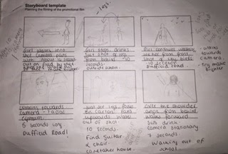 This is an example of one of the pages of my groups storyboard. As you can see we focused more on the writing than the drawings as we thought that would help us more. Most of it was accurate, for example, the lengths of the shots and if the camera should be stationary/moving. However some of the pictures are not detailed enough which made it hard when it came to actually filming and the storyboard was all we had. In addition, the fact that most of the notes were rushed made it harder for them to understand. I think I misunderstood how important the storyboard would be when it came to recording.
 What were your strengths and weaknesses in the group?
I'm better at planning rather than carrying out the actual task and Sam can lose focus quite easily during this stage. However when it comes to the pratical stage of the task Sam is a lot better as I think he had previous experience with the editing programmes. Ultimately, this wasn't such a big issue as both our strengths and weaknesses balanced out when working together.
Did you get all the footage you wanted?
We got everything that was on the storyboard, however there are a couple of things I would have liked to redo such as the first scene and maybe make more of the scenes look like they do in the original clip. Something I especially would have liked to have done is go outside when there was a PE group so they could run past which would have made it look more similar to the original version. I think we got as much done as we could in the hour in which we were given to complete the filming part of the task.
What technical skills - camera and premiere - did you learn?
When Sam first handed me the camera I was virtually clueless as I have never owned a video camera, therefore everything was pretty much new to me about that. In addition, I am still reasonably new to Premiere and this made it a lot harder when it first came to editing. I eventually learnt how to use all of the effects by dragging them where on the clip you want them to go. Also, I learnt how to fade out at the end (both audio and video) which made the overall clip look a lot more professional. I learnt how to put titles as well.
How does it compare to the original?
We tried as hard as we could to get it as similar as possible to the original version but there were some obvious restrictions including the cartoon-like effect that is used throughout the clip. We also wanted to have the runners, similar to the original. however that wasn't possible as there were no PE groups available at the time. Some of the transitions were also not available on Premiere which meant that we had to use subsitutes instead, although we did try to find ones as similar to the original as we could. Things that were similar included the scene that has the guitar and the chair, we were both impressed with this particular part of our clip. Also, when 'Juno' is walking past a shop and the camera views her from sideways. As the clip went on, we tried to make it more similar to the original as possible, this is because we became more familiar with the camera and also had more time.
What went well? What I learnt? What will I take with me to the next production?
I think that me and Sam worked well together and that is something that made the whole thing work reasonably well. The editing went well as we could both say what we thought looked best rather than only having one opinion. We also managed to work effectively and get everything done within the timeframe we were given. I learnt that I need to put more emphasis on having a good storyboard as that makes the rest of the process a lot easier. Being organised and not wasting any time is something that I will take with me to the next production as that helped a lot, it meant that hardly any of it was rushed and therefore not as good as we could have done. Also, I will take with me the skills of being able to use a video camera and Premiere.
The Book Thief - Clip
I think the Mise en Scene in this clip is really powerful. Every element contributes to making it seem more realistic. The setting contains lots of Swastika's which is how it would have been at the time. It is in a typical German town/village also. The positioning of the characters (and the vast amount) also is powerful as it creates a sense of what they're doing must be important which is how it would have been. In addition, The costume is one of my favourite parts as they have been designed to look exactly how they would have been during the Nazi rule. It engages the audience more as it is a real insight as to how one of these 'book burning's' would have been. The facial expressions are all serious and everyone looks passionate about what they are saying/singing which reflects the extreme Nationalistic attitudes Germans had at the time. One of the most powerful parts is perhaps that most of the dialogue in this clip is in German which definitely adds to the realistic element.
Practice Edit
This is my practice edit that I made using Adobe Premiere Pro. At first I had no idea how to use the software but after playing around and experimenting with the tools I found it a lot easier to edit all the little clips. Our task was to at first, chose an audio clip and put it behind all these video clips of dancing animals and images of New York City. This was fun as I could experiment with speeding up the audio clip, resulting in a higher pitched voice. The second task was to create a James Bond clip which was also fun as I had to work out the best way and best songs/video clips to use to build suspense.
I think it will be easier when I have to edit my own footage as I will know from the beginning what I want the end result to look like.
Narrative
CLAUDE LEVI-STRAUSS: Binary Opposition.
- He was less interested in the order of events in narratives and more interested on the themes underneath. He argued that narrative depended on binary opposites or conflicts between two terms, e.g. good and bad.
TORODOV devised a way of analysing narratives by the way they move through different stages.
Break down narrative into 5 stages:
Equilibrium: Setting is established.
Disruption: The story takes a particular direction.
Recognition of Disruption: Characters and events are interwoven.
Attempt to Repair Disruption: Try to solve the issue.
Reinstatement of Equilibrium: Matters are sorted out, problems are solved and questions answered.
VLADAMIR PROPP
Propp suggested that in any story there are only ever a limited amount of character types, each of whom has their own purpose in the narrative.
Hero: The main character around which the narrative is centred. Normally has some kind of mission or quest, e.g. Shrek.
Heroine/Princess: Acts as a reward for the Hero succeeding in his mission/quest, e.g. Princess Fiona.
Princesses Father: Hero must win approval from Father in order to win the Princess, e.g. Shrek, being an ogre, must prove to the King that he is right for his daughter.
Villain: Seeks to stop Hero from succeeding in his mission, e.g. Prince Charming.
Donor/Mentor: Gives hero important information or a magic item to help them, e.g. Puss In Boots.
Helper: Accompanies hero but cannot always complete question themselves, e.g. Donkey.
AN EXAMPLE OF NARRATIVE:
The Equilibrium in The Lion King is Pride Rock and all the animals being in harmony with each other, we can tell this from the song 'The Circle of Life'. The disruption in the film is when Simba's curiosity leads him to go out of his kingdom and face his evil uncle Scar, however Scar's plan to kill Simba fails and he is left with the idea of killing the current king too, enabling Scar to become King. Scar is successful in killing the King but unsuccessful in killing Simba. The Recognition of disruption is when Simba runs away and this allows Scar to become King of Pride Rock. Simba attempts to repair the disruption by coming back as an adult lion to challenge scar and gain his rightful place as King. He manages to defeat Scar and restore Pride Rock to how it was before Simba's father was killed - this is the reinstatement of equilibrium.
Based on Propps Character idea:
Hero - Simba
Heroine/Princess - This could be seen as Nala, however in this case I would say that Pride Rock would be the prize for defeating Scar.
Villain: Scar (Simba's evil uncle)
Donor/Mentor: Rafikki
Helper: Timone and Pumba.
Film Pitch
The Toy Company from oliviaseymour
*ANOTHER ADVERTISING IDEA*
- As it is a children's film we thought it would be a good idea to have pictures of the film on balloons and then have people handing out the balloons in town centres/cities which excites the children because most children love balloons but also catches the adults attention and may make them research the film which will make people more likely to come and watch it.
-----------------------------------------------------------------------------------------------------------------------
This is the film idea that me, Sam Bellman and Olivia Plumpton came up with. We were given a genre and two lessons to come up with a plot, character/cast list, BBFC certificate and marketing ideas. This task was challenging but also fun at the same time as we were able to be imaginative and think outside of the box. We presented the slideshow above to the class and received feedback, which was mostly positive. We received mostly 7/8/9's out of a possible 10 in all sections of the feedback sheet which I think is good. People liked our cast list and our marketing ideas, especially one that isn't mentioned on here but involves handing out balloons with the film poster on to children in popular cities/towns.
In the future I would definitely split up each section and allocate it to a certain member of the group and then put it all together at the end. This is because ideas can clash and this can slow down the process. Doing parts individually will also allow more thought to be put into each section and more time to be taken on it, rather than it being rushed. Ultimately, the end result should be better.
In conclusion, I think the film idea went relatively well and that our plot was good but I wish we had more time to spend on it/that our group allocated separate parts to individual people.
Insidious: Chapter 2 Analysis - DISTINCT
DISTINCT
Describe in detail...
Setting
Themes
Icons
Narrative
Characters
Textual Analysis
This film seems to be set mainly in a house, probably in the USA according to the characters accents. All of the shots are interior which suggests that it'll be this way for the most of the film. The main themes seem to be death, horror and supernatural events. The beginning of the film seems to be centred around the death of the woman who is shown at the beginning of the clip. The wife is trying to prove her husbands innocence, although it appears that she's not entirely sure it wasn't him. The woman seems to be distressed for the majority of the clip, this woman's death has obviously affected her in more ways than just one. This could suggest that there was some kind of relationship between the woman that has been killed and the man's wife. The couple seem to be the main characters although there may be other characters introduced later on in the film. Low-key lighting seems to be used mainly and this indicates that this film is a horror.
Guardians Of The Galaxy Analysis - DISTINCT
DISTINCT
Describe in detail...
Setting
Themes
Icons
Narrative
Characters
Textual Analysis
This film is set in space and seems to be slightly futuristic. The main themes seem to be vengeance, comedy and drama. It appears to be about protecting the galaxy, hence the title 'Guardians of the Galaxy', however it also contains comical elements. The main characters include Drax, Rocket, Gamora and Groot who all seem to be major criminals and then the protagonist appears to be an ordinary man, with a minor criminal record, who calls himself Starlord. 'Starlord' gets most of the camera shots which indicates that he is the main character in this film. The use of both high-key and low-key lighting highlights that this film is a hybroid - a mix of sci-fy and comedy. The high-key lighting is used for the comical scenes and the low-key lighting helps to build suspense. The music also doesn't seem particularly threatening like you would expect a sci-fy film to be which definitely adds to the use of comedy in this film.
The Vow Trailer Analysis - DISTINCT
DISTINCT
Describe in detail...
Setting
Themes
Icons
Narrative
Characters
Textual Analysis
This film seems to have equal interior and exterior shots and to be set in the USA. As the film seems to take place over a long period of time, there is no distinct season that it is set in, this could represent how long it will take for him to make her fall in love with him again and that love is everlasting. It seems to also be set in the present. The main themes include romance, tragedy and drama after the woman's car accident. The vows that they made on their wedding day seem to be of the greatest significance in the trailer, vows are something that are supposed to be eternal and this mans love for his wife is.
It seems to be about a man and woman's relationship and how it grows until she has a car accident which leaves her with memory loss, meaning she cannot remember her husband. He has to then embark on making her fall in love with him again. The main characters seem to be the married couple although minor characters such as doctors are present in the trailer. The use of high-key lighting shows that the film isn't aimed to scare and the music isn't scary but isn't completely cheery either, showing that the film contains an element of drama.
Mise En Scene
Mise en Scene is a French term meaning what's in the scene. Essentially it is the information in front of the camera for the audience to help them work out what is going on.
It is made up of 5 elements:
- Settings & Props
- Costume, Hair & Make Up
- Facial Expressions & Body Language
- Lighting & Colour
- Positioning of Characters
SETTINGS & PROPS
- Settings and locations are not just 'backgrounds'. They play an important part in film-making.
TYPES OF LIGHTING
Low Key Lighting: Created by only using the key and back-lights. Produces dark contrasts of light and dark areas. Deep, distinct shadows/silhouettes are formed, e.g. horror films.
High Key Lighting: More filler lights are used. Lighting is natural and realistic to our eyes. Produces brightly lit sets or a sunny day, e.g. Rom-Coms
 The picture is set in London, an older part with older buildings. Old buildings have the connotations of importance and classical and Bond is supposed to be a classic and important character. The fact that Big Ben is placed in the background is a use of iconography.
Bond is wearing a dark jacket which has connotations of mystery and because we cannot see his face, this adds to the mystery element.
The use of high-key lighting over the buildings in London could show that the ordinary people below have no idea of what is really going on and think that everything is normal. However because Bond is dressed in black, this could illustrate how he knows the hidden and dark secrets that the city really holds. He is positioned above the city, which represents how he is protecting London from evil.
Another Example of Mise en Scene:
 The film seems to be set on a plane which contains a scary element as all these people are shut in this enclosed space from which they cannot escape. The use of the gun as a prop could indicate that the genre of this film is a thriller. Liam Neeson is dressed in black which again, shows that he may be mysterious or maybe even the villain. Neeson's facial expression looks serious but not frightened whereas the people behind look terrified and are obeying the orders of Neeson. High-key lighting is used which shows that this is meant to be an everyday situation. Neeson is positioned at the front which shows how he is the protagonist.
It is made up of 5 elements:
- Settings & Props
- Costume, Hair & Make Up
- Facial Expressions & Body Language
- Lighting & Colour
- Positioning of Characters
SETTINGS & PROPS
- Settings and locations are not just 'backgrounds'. They play an important part in film-making.
TYPES OF LIGHTING
Low Key Lighting: Created by only using the key and back-lights. Produces dark contrasts of light and dark areas. Deep, distinct shadows/silhouettes are formed, e.g. horror films.
High Key Lighting: More filler lights are used. Lighting is natural and realistic to our eyes. Produces brightly lit sets or a sunny day, e.g. Rom-Coms
This is the example of Mise en Scene that we used in class:
The picture is set in London, an older part with older buildings. Old buildings have the connotations of importance and classical and Bond is supposed to be a classic and important character. The fact that Big Ben is placed in the background is a use of iconography.Bond is wearing a dark jacket which has connotations of mystery and because we cannot see his face, this adds to the mystery element.
The use of high-key lighting over the buildings in London could show that the ordinary people below have no idea of what is really going on and think that everything is normal. However because Bond is dressed in black, this could illustrate how he knows the hidden and dark secrets that the city really holds. He is positioned above the city, which represents how he is protecting London from evil.
Another Example of Mise en Scene:
Genre
Genre: A style or category of film, art, music or literature. It aims to please the audience as there are certain things that people associate with certain genres and therefore this creates expectations. You can look at codes and conventions and know what genre you're watching. Genres feature a set of characteristics and conventions which are recognized by the audience. Different genres appeal to different people. If a film that is supposed to be a specific genre doesn't include these characteristics then the audience will be disappointed. Genres create a relationship between the producers and the audience.
Different types of genre include:
- Action/adventure
- Sci-Fy
- Comedy
- Historical
- Children
- Horror
- Thriller
A HYBRID is a mixture of genres.
In groups we had to walk around our school site and take pictures of things that were relevant to certain film genres. My groups pictures and explanations of them are shown below:

The idea behind this is to create the obvious idea of love with the heart. The wall in the background represents simplicity, and the idea that true love should, in theory, be simple. Audiences would know that this is supposed to be a romance film by the heart.
This could have gone better if we had a red brick wall, red representing love.

This is supposed to be an image representing horror. First of all the colours are black and white with a light focusing on one thing (low-key lighting) which indicates that it's going to be eerie. Around the eye is a sort of white mist which you would typically see in horrors. The eye looks like an ordinary eye looking into a dark, scary place which makes you feel worried for what the person may experience once inside. This horror film could be centred around hidden secrets/someone watching you.
I would have liked to make the eye look a bit more scary although I think the idea of it looking so normal and innocent adds to the horror factor.

This is supposed to represent an action film as the skip is meant to make it seem like we shouldn't be in that specific area. We used the skip as our prop as it looks scratched and damaged with lots of rubbish it which has a bit of a eerie feel, I was aiming to make the picture seem like it was in some deserted place and the only thing we could take cover behind was this old skip. The pointing indicates that the thing that the two people are looking for are in that direction and because its behind a wall, it makes it look like the two girls are hiding.
This could have worked better if the school building wasn't in the background and we could have used a more empty area to take the pictures,

This represents sci-fy as it is supposed to look like the girl is trapped. The girl looks quite ordinary which could mean that she has been trapped in some parallel universe where normal is a crime. She looks more confused than upset which could mean that she doesn't know how she has ended up there. The fact that my hands are on the panels of the gate could show that I want to escape but have given up hope trying.
If given more time and more facilities to work with this could have been better as I could have worked with costume and background more.

The picture is supposed to represent comedy by just looking a bit silly. The girl under the piece of equipment which looks expensive and hard to operate clearly doesn't know how to use it and therefore this creates a comical element as she's doing the opposite to what she's supposed to. The other girl is attempting to spray her with something which, for all she knows, could be a dangerous chemical. It makes both of them look a bit ditsy and oblivious but also funny at the same time.
I found this one the most difficult as its hard to know what is classified as funny and what isn't. It could have worked better if we had more time as we could have found better facilities to use and thought about it more. Originally this was supposed to represent the Sci-Fy genre due to the space-looking equipment but as the picture looks more comical than serious, we decided to use to to represent comedy instead. Perhaps it could also be used as a comedy/Sci-Fy hybrid.
Different types of genre include:
- Action/adventure
- Sci-Fy
- Comedy
- Historical
- Children
- Horror
- Thriller
A HYBRID is a mixture of genres.
In groups we had to walk around our school site and take pictures of things that were relevant to certain film genres. My groups pictures and explanations of them are shown below:
Romance
The idea behind this is to create the obvious idea of love with the heart. The wall in the background represents simplicity, and the idea that true love should, in theory, be simple. Audiences would know that this is supposed to be a romance film by the heart.
This could have gone better if we had a red brick wall, red representing love.
Horror
This is supposed to be an image representing horror. First of all the colours are black and white with a light focusing on one thing (low-key lighting) which indicates that it's going to be eerie. Around the eye is a sort of white mist which you would typically see in horrors. The eye looks like an ordinary eye looking into a dark, scary place which makes you feel worried for what the person may experience once inside. This horror film could be centred around hidden secrets/someone watching you.
I would have liked to make the eye look a bit more scary although I think the idea of it looking so normal and innocent adds to the horror factor.
Action
This could have worked better if the school building wasn't in the background and we could have used a more empty area to take the pictures,
Sci-Fy
This represents sci-fy as it is supposed to look like the girl is trapped. The girl looks quite ordinary which could mean that she has been trapped in some parallel universe where normal is a crime. She looks more confused than upset which could mean that she doesn't know how she has ended up there. The fact that my hands are on the panels of the gate could show that I want to escape but have given up hope trying.
If given more time and more facilities to work with this could have been better as I could have worked with costume and background more.
Comedy
I found this one the most difficult as its hard to know what is classified as funny and what isn't. It could have worked better if we had more time as we could have found better facilities to use and thought about it more. Originally this was supposed to represent the Sci-Fy genre due to the space-looking equipment but as the picture looks more comical than serious, we decided to use to to represent comedy instead. Perhaps it could also be used as a comedy/Sci-Fy hybrid.
Film Poster - Semiotics

SEMIOTICS DEFINITION: The study of signs and also of anyhing which stands for something else. We read images and pictures in an attempt to decode them and make sense of what they mean to us.
DENOTATION: What we see when we look at an image (what it is)
CONNOTATION: Wht we undertstand from this image (what other meanings it has)
Colours Used
The colours used in this film poster such as the light blue in the background reflects a happy tone but also a feeling of loneliness perhaps. There are also streaks of white in the sky which signifies purity and innocence. The red of the mane implies power but also danger. The mane is a warm orange at the top showing that this lion is a warm and kind character but as you look further down the mane, the red gets darker which could suggest that there are hidden secrets. The golden colour of the lions suggests royalty, which reflects the title.
Positioning
The male lion is placed above all of the other characters which shows that he is the most powerful and in charge. It shows leadership and that this lion has responsibility. The faded lion in the sky could represent the idea that the male lion is being watched from above for how he leads and the decisions that he makes. The red-maned lion isn't looking at the figure in the sky which could imply that he is trying to avoid his responsibilities but doesn't want to face the consequences for doing so. The female lion just below is looking in the same direction as the male lion, showing that they have the same visions and dreams. On the rock we can see three other animals and even though they are small, the fact that they are standing on a rock which is evidently higher than the ground, shows that they are all important and significant to the story. The rock signifies leadership and authority and because they have all been placed on it, it must mean that they are important to a certain extent.
Gossip Girl Opening Scene
This video opens with a clip of a girl on a train, this immediately creates a sense of mystery as no explanation of where she's going is given. It is situated in a train station - Grand Central - which could suggest that this is going to be about why this girl has returned/arriving in New York. As all the clip is focused on this blonde haired girl, we can assume that she is the protagonist in this series which creates intrigue as the audience will want to know where she's coming from and why she left in the first place. We can also tell that technology will play a big part in this series as it shows a girl taking a picture of the blonde, the fact that she is taking a picture of her could suggest that she is supposed to be well known/famous in the series.
The normal, everyday clothes and the iconic setting of Grand Central Station along with the high-key lighting shows that this series could include romance, drama and teenage issues. The fact that it is set in Grand Central Station and that the blonde is placed on the balcony whilst she watches over below shows that she could be of a higher social positioning than most. However she looks anxious about returning and this could mean that her looking down could simply be her worry of what people will think.
Subscribe to:
Posts (Atom)