Parallel Final

Question Seven

Looking back at your preliminary task (the continuity editing task), what do you feel you have learnt in the progression from it to the full product?

For this task I am going to pick certain shots from my preliminary task and compare them to shots from my final media product. I will look at the similarities and differences and also new things I have learnt.
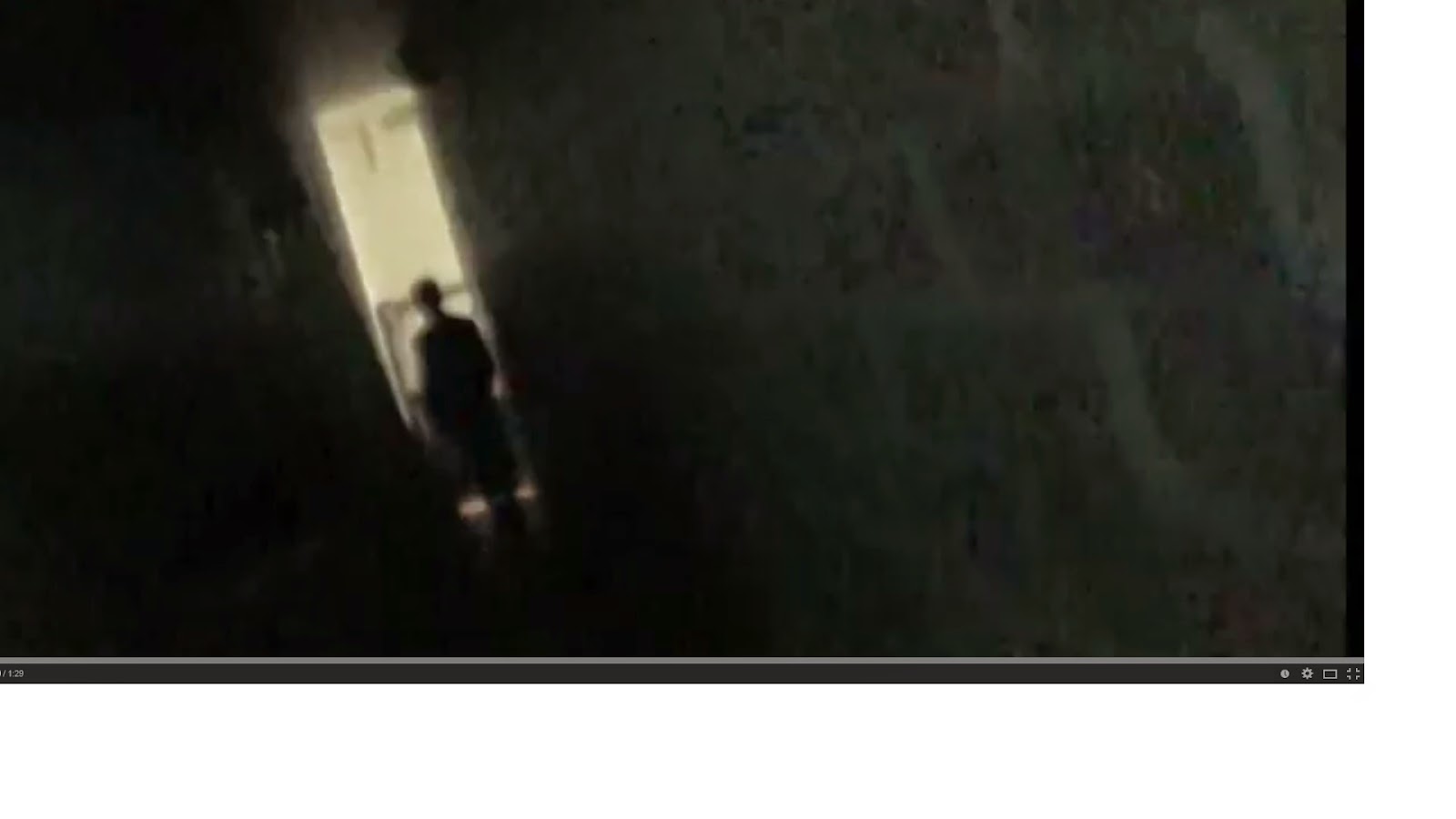


Here is the first shot of my preliminary task which is quite confusing now I look back and doesn't really give the audience much indication as to where the film is going. It also doesn't have a production company which is something that makes the opening look a lot more professional and realistic.
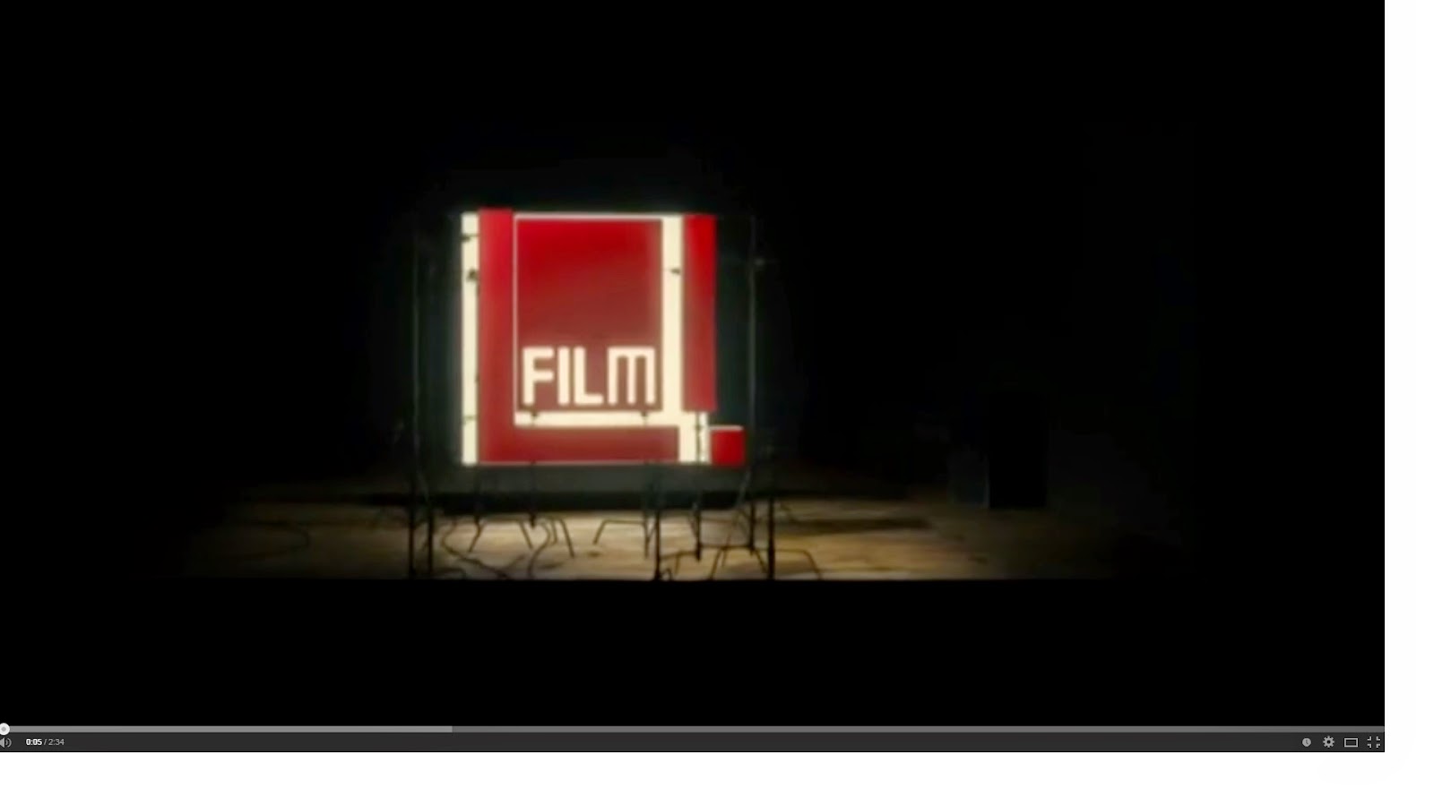


This is the first bit of my final media product and it is the production company, Film 4. This helps to make the film look more professional and also introduces the film at a slower pace which allows the audience to think about what's happening more. 

This is the first title in my preliminary task. I had little knowledge on titles at this point. I only used one production and distribution company which I've learnt is something that is unlikely to happen with an independent film or any film in general.


This is the first title in my final product which is 'Film 4 Presents' on top of the first scene in the opening. This makes it look more professional and fits with our genre as the titles are not supposed to be so in your face. The font and timing is also more realistic in my final product than in my preliminary where there is hardly enough time to read what it actually says.


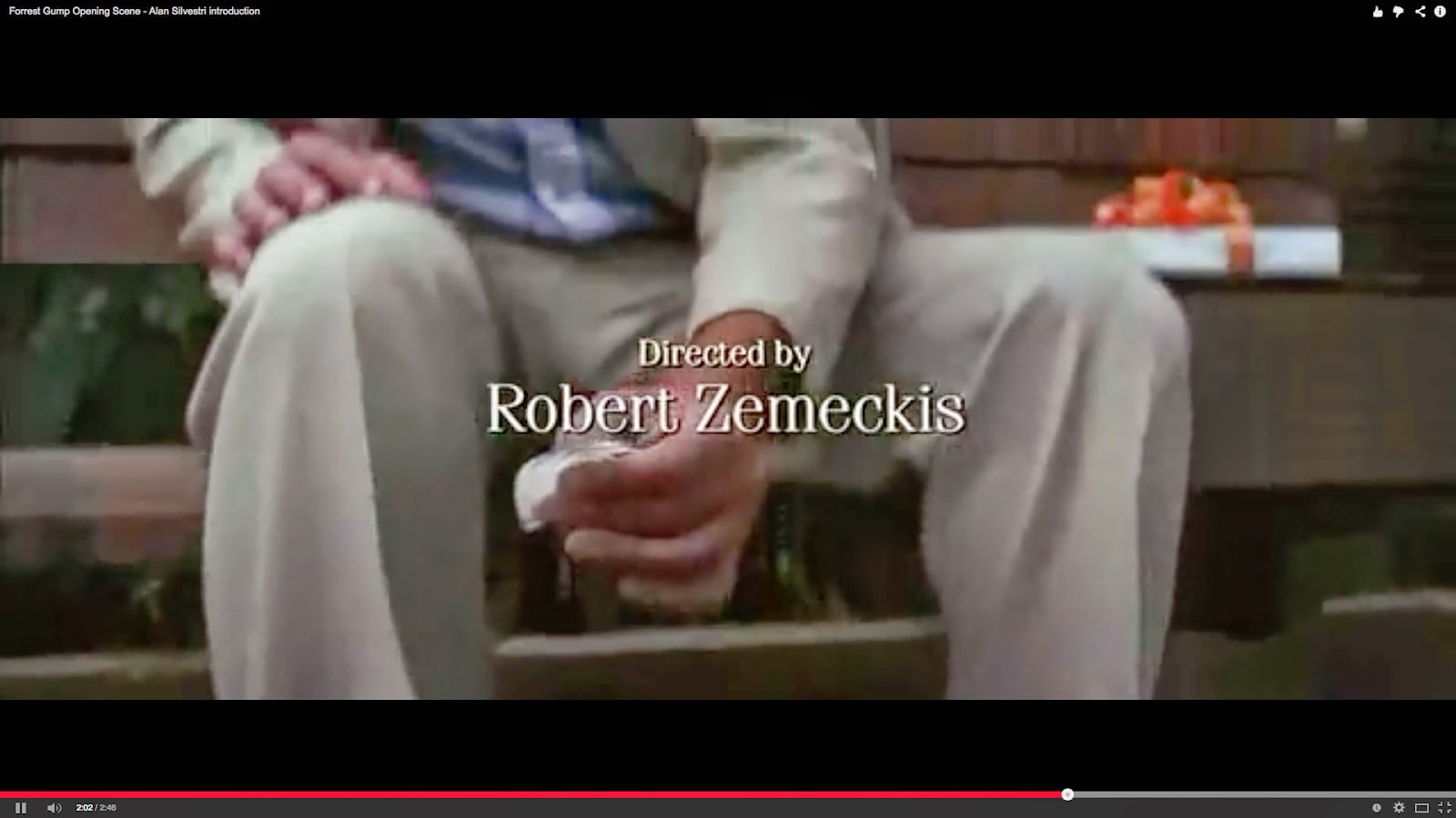
 This is the title of the film in the prelim which is on a dark background and not very effective. I have learned a lot when it comes to titles since this and this is supposed to be the most important one. It is also on for a short amount of time.
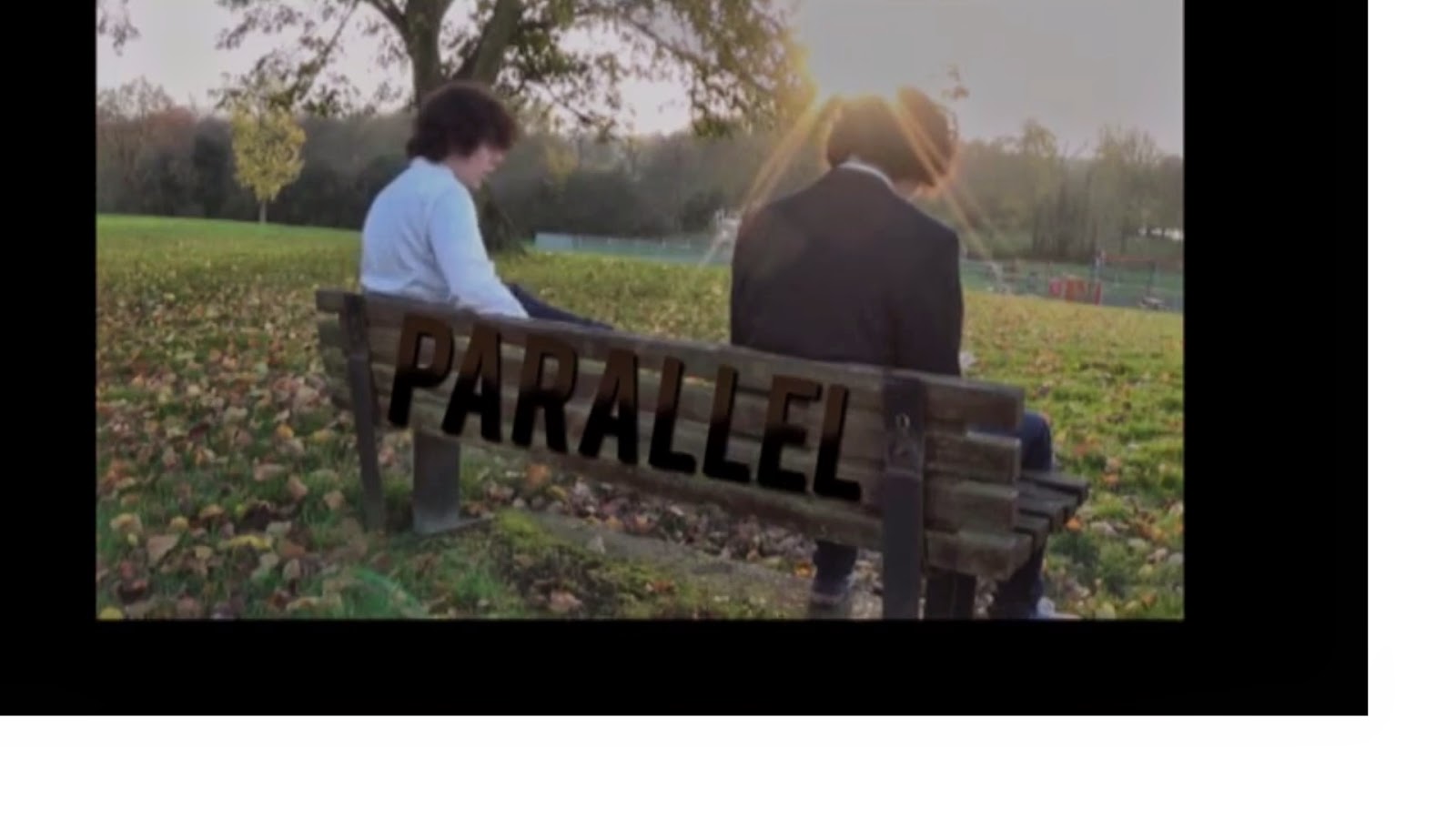


This is the main title of our film and we put it in the correct place this time, half way through all our titles. I have learnt where titles should go and this makes sense as it is the first shot where Zac and Zabel are together. We also played around with the colours to try and blend it into the bench, again making it not too in your face.
This is the last shot of my prelim task which is effective and conforms to the genre however this is more like the ending to a film rather than a slow introduction into a film. It doesn't really leave the audience asking any questions.

This is the last shot of our final product and this is a lot more effective than the prelim as it is not such a sudden ending.
I've learnt the importance of a tripod and keeping the camera steady.


Main things I have learned:
- Editing: I have massively improved my knowledge and ability to include effective and correct titles. This was learnt through watching similar films and doing much research into titles, something I didn't do for my prelim task. I have learnt the importance of research. I have also learnt how to mask which is such a good and professional-looking effect if you can get it right. Furthermore, I have broadened my knowledge on other effects and transitions. 

- Camera Work: Before and even during the preliminary task, I was quite anxious about using a camera as I didn't really know how to use it properly. I didn't know what shots to include. However for the final product, we made a shot list before filming which was really beneficial. As we were filming and started to include some of these more professional shots such as the 180 degree rule when Zac and Zabel were talking. In my prelim I tried to use the match on action but it wasn't very smooth. In our final product we learned the importance of including a variety of different shots to keep the film interesting and engaging for the audience. 

One of the main things I have improved on is my ability to plan and knowing the necessity of planning in advance before filming or doing anything. This is more efficient and saves any mistakes from being made.

Question Six

What have you learnt about technologies from the process of constructing this product?


This is a Prezi made to demonstrate the types of technologies used in the making of our media .


Question Five

How did you attract your audience?

I have made annotations on our final version of our film which explain how we have tried to attract the audience:


I also made a video of people giving their opinions on our film and overall it shows how we were successful.

Question Four

Who would be the audience for your media product?


Powered by emaze


This is an E-Maze showing the audience for our media product. We have decided to go for an 'indie' 18 year old as our idea target audience as the music and storyline would appeal to them. In this presentation we explore the lifestyle of our target audience.

Question Three

What kind of media institution may distribute your media product and why?


This is a video explaining the types of institutions who may or would not produce/distribute our film.

Question Two


In our media product we focused on various representations such as gender and age when it came to Zac. In this question, I have compared him to other characters similar to him but also explained how Zac does or does not follow or go against the typical representation.

GENDER: 

I have made a character profile of Zac to explain the typical representation of gender:


This profile compares him to another, similar character - Simon James, and also explains why he goes against the typical representation of his gender.


AGE:

Typical representation of a boy of Zac's age: 


Some would be portrayed as going out to parties and being around their friends a lot. They could be seen as immature and to not be serious about much.

Zac goes against this representation of age as he doesn't appear to have many, if any, friends and is shown to live a very isolated lifestyle. 


Another representation of age is the 'geeky' type of boy. Not many boys pictured above would also be pictured studying in most media products. This shows a big contrast in two different representations of the same age group.

Zac supports this representation and goes against it at the same time as he looks like he is interested in academics as he is reading a book about psychology in the beginning of our film. He goes against it however as it is not clear that this is actually what he is doing, he is not shown to be at university.


An example of a representation in a real media product: 

This is a character, Lucas, from the television series Pretty Little Liars. Although this is not a film, it represents age in a similar way to our media product.

Lucas is portrayed as being geeky and shy, into school and extra-curricular activities such as the Yearbook club. He is shy and not good at confessing how he really feels.

This is similar to Zac as he is extremely shy and timid and will not readily talk to anyone else. This could show how he fits the 'geeky' representation of a young adult.  


This is Caleb, another character from Pretty Little Liars. In the series, Lucas sees Caleb as an enemy due to them liking the same girl.

Caleb is manly, handsome and often gets himself into trouble. This is similar to the very first representation of age I described.

This is similar to Zac and Zabel as Zac sees Zabel as a threat to his freedom. This fits the representation of age that the more popular, mischievous boys are superior and more powerful than the geekier, more intelligent and shy characters. 

Question One

1. In what way does your media product use, develop or challenge conventions of real-life media products? 


This is a Prezi with our nine shots and explanation of how they develop, challenge or conform to our genre.


CONVENTIONS:

 I did some research into the different conventions of indie films but also watched similar films to our own and looked at the types of things they included. I then compared my research with what I found with watching films and picked out the six main conventions that featured in both.

NARRATIVE:

This is an explanation of Torodov's Narrative Theory and in-depth explanation of our 'equilibrium'. There is also a picture from 'The Double' which is a film we used for inspiration. 

This is a comparison of Torodov's Narrative Theory using The Double and our media product, Parallel. As we couldn't fill in all the sections for the Theory, we included some ideas of the direction the film could take if we made the whole thing. 

This is another example of applying Narrative Theories to our media product with Barthes and Levi-Strauss. 

CHARACTERS:

Zac: He is supposed to be a young adult suffering from a mental illness. However, from his suit and calm attitude at the beginning, the audience probably wouldn't expect this, I think this conforms to the genre as in Indie films, the protagonist is not usually predictable. This shows in Shallow Grave as it is hard to work out how the characters are going to act.

Zabel: I would say that Zabel is quite stereotypical character as alter-ego's are rarely portrayed as helpful or even angelic like. This challenges the genre as I said before, the characters are not supposed to be stereotypical.


m
This is our example of our characters in Propp's Theory. As the story was not developed fully, we were unable to add many of the characters. However. this also conforms to the genre as independent films are supposed to have a small cast.


Production Diary


Parallel production diary from oliviaseymour

This is my production diary for the construction of our opening sequence. In this PPT format, it clearly demonstrates the journey from having no idea of what to do, to the final draft. 

Feedback from First Draft

We already had a rough idea of what we needed to change from our first draft before people saw it as our editing took a long time due to the masking effect we needed. This meant that we focused primarily on getting that part right that we didn't have enough time to tidy up the other parts.

When we did receive our feedback, it was more positive than I thought but they also highlighted other parts that we should change. For example, including music. We thought music would not be a particularly good idea in the beginning but after reading the feedback and testing it out, it may be something that we actually include.

Below shows some pictures of our feedback:


People tended to like the cloning effect which is good as we spent a lot of time trying to get that right. They thought the acting by Max was good and convincing. Our criticisms include the shaky shots and some of the cuts needing to be quicker which we plan to sort out. Overall the feedback was extremely useful to us as a group.


We spoke as a group and decided that these were the main things we need to improve upon:
- Title order, size and font
- Cut out wobbly shots
- Find different sound effects/music and cut out bird sound.
- Remove the title at the end of the sequence.
- Make it more interesting by removing some of the walking shots.


Parallel First Draft

This is the first draft for our film opening sequence:
 

Fonts For Titles


This is our favourite idea for fonts for our titles at the moment. We think that this font is quite quirky but also quite simple which portrays our genre quite well.

Filming Pictures


These are some pictures that we took during filming. It shows some of the locations and also Marcus actually filming some of the shots. 

Group Meeting Pictures


This is one of our group members (Mollie) working on things for our film. She has been mainly working on the research side of things and has contributed a lot to our planning. 

Shooting Schedule


This is out shooting schedule. It could change due to the weather and may also have to be extended due to us trying to do it on just two different days. There may also be a possibility that we can film on the Sunday.


Here is the current weather forecast for Friday, the weekend and Monday (our planned film days). At the moment it looks like we will be able to film on all of the days which is good. 

Risk Assessment


This is our risk assessment for our film, Parallel. Most of the risks are minimal but it is important to recognise that there are risks involved to make sure we can reduce the chance of anything happening as much as possible. 

Synopsis

What we will need:

  • A bench in Admirals Park
  • Bus stop. (Preferably not in use by other people) 
  • Trees in the park
  • Pavement beneath the bench
  • Suit 
  • Smart shoes and bag/briefcase
  • Medicine bottle and new label 
  • Tic Tacs  
  • Coke and Diet Coke 
Characters:

Max will play both schizophrenic men on the bench as it will be a clone. Olivia will play an unfortunate woman who happens to engage eye contact with Zabel/ Zac (Max) on the bench in Admirals Park.

Costume:

We have decided to have Max in a suit so he looks like an average working man but when the film starts, the problems start to unfold and it becomes clear that he has schizophrenia.  

Location: 

Our film opening will be located in Admirals Park. We will use the bus stop opposite the park on Rainsford Road, depending on how much filming we can get done and if we stick to the shooting schedule. 

Audience: 

We have pitched our audience to be between the ages of 18-30 however not excluding any ages older than that. We didn't think anyone younger than 18 would enjoy or understand our film which is why we set the age to 18. The certificate is 12A.


Blog Reflection 1

TECHNOLOGY:
One of the new online programmes  I have used the most is SlideShare for uploading my PPT. This is becoming more important for me as during the planning for our opening sequence we have to make lots of PPTs for a lot of our research, e.g. audience research. I have also used Prezi (once shown on the blog) for my Prelim task. I have tried to use it on other occasions to and am currently making one for my Marketing Research, however I do find is slightly confusing and I am definitely more comfortable using PowerPoint. I am planning to try more technologies in the future such as E-Maze. Recently I have been experimenting with Premiere a lot for titles for our film so have been looking at the different fonts available and sizes that would work, etc. During my Juno edit, Sam and I used a cartoon-like effect which we found on our own which is quite cool. Also, I found out how to put the whole sequence in black and white which was useful for my Prelim task. We are also going to use a cloning effect that Max will teach us to do which we will use in our final task.

MARK OUT OF 20:
I think I would maybe get 15/16 out of 20 at the moment. I think I need to go into more detail with certain things and extend my analysis, however it is all organised and I have good time management. All the tasks are completed and the majority are very detailed.

PARTS WHERE I COULD BE MORE THOROUGH OR LESS COMPLACENT?
I could be more thorough in my analysis of my titles research. I also could go into more depth in my representations.

IS IT FUN TO LOOK THROUGH?
I think it is fun to look through as there are many pictures and PPTs instead of just text. I have also put it with a white font which I think is more interesting than just a white background and black text. I change the style of my blog quite regularly to make it more interesting. I do need to add some more pictures to break up the text.

IS THE LEARNING JOURNEY EVIDENT?
I would say that it is very evident as looking at my first ever editing task to looking at my prelim task, a lot has improved. Although my prelim was not perfect, since then I have gradually become more skillful with programmes such as Premiere. I have picked up on all the theories and types of institutions. Hopefully my learning journey will become even more evident after finishing my final opening sequence.

TARGETS:
I think I need to link my film opening idea to the conventions of the genre more. Also I need to improve my knowledge of all the different theories and finally make my blog perhaps a little more visual. 

Storyboard


This is our storyboard for our film opening with a voice-over by Max. Some of the pictures are not that clear in the video as our film was quite dialogue-heavy, we used the script a lot more.
Parts of the storyboard changed when we actually started filming as it started to get dark around the time we wanted to film the bus scene. Instead of waiting for a bus to come we decided to use a door instead as it was less time-consuming but still created the same effect.

Timeline of Shots and Titles


This is a timeline of all our shots and titles that we plan to include in our film opening sequence.

Mise en Scene Ideas

MISE EN SCENE:
- Settings & Props- Costume, Hair & Make Up
- Facial Expressions & Body Language
- Lighting & Colour
- Positioning of Characters

As our film sequence is all outdoors, this makes finding a location a lot easier. We plan to film in Admirals Park. We were thinking about other parks but we decided that this one was ideal as it is quite big and picturesque but also close to a bus stop which is another part of our setting.
Our costume is also quite simple as well as there is only one character on one day so we only require one costume. We decided that the man (Zac) should be wearing a smart suit, nearly immaculate as he is supposed to be boring and plain. Whereas Zabel, the other personality, will be wearing the same suit but messy to represent his evil character. The costume of the other woman will be smart/casual, perhaps she is on a lunch break.

Facial expressions will be important in our sequence as Zac is supposed to be angry/frustrated/embarrassed quite a lot. Facial expressions will also be important when Zac finally caves in and shouts at Zabel, after which the woman sitting next to him quite obviously thinks he is talking to himself.

Although lighting is quite hard when we have a limited amount of time to film, we are going to try our hardest to get it all in the day time when the camera quality will be the best. This is also because we are trying to represent everyday life.

The main focus of the sequence is Zac so he will be on camera the most. It should be clear that he is the protagonist as he is the first person to come on screen and the main focus on the first couple of minutes is him.

Script

 
This is our script for our opening sequence. We looked at other scripts and tried to do ours in a similar way. When we come to filming then it is obviously subject to change but we are very happy with it. We know that it is quite dialogue heavy but we plan on re-dubbing most of the talking to make it sound as clear as possible. 

Institutions Research

FILM FOUR 


Film 4 is a British film institution company that is owned and operated by Channel 4 Television Corporation and it has screened many films. It has also distributed many successful films such as Casino Royal, Slumdog Millionaire, Shaun of the Dead and most importantly, The Double and Shallow Grave. Film 4 has a niche, mature audience which we intend to aim our movie at.
The main reason we decided to use Film 4 as our distributor is because we modelled our film around The Double and Shallow Grave which were both produced/distributed by Film 4. This means that they have experience in a similar film to ours which helps things like marketing.


NEW LINE CINEMA 


Founded: 1967
New Line produced the Oscar Award-Winning The Lord of the Rings film trilogy. Some others of its most popular films include The Mask, The Austin Powers titles, Hairspray, Rush Hour, Elf, Sex and the City and Wedding Crashers. Since 2008 (when it became a unit of Warner Bros) the company has seen the most successful period in its history.
Like Film 4, New Line Cinema aims its films at a more of a sophisticated audience. This is one of the reasons we want New Line Cinema to help produce and distribute our film. It can help us greatly in advertising to the right audience. Also because of its success it will help us advertise on a large scale.


Audience Research


This is our audience research. People said our target audience was too broad so we decided to take three people of different ages and say what aspect of the film they would like. We also used a contrast and included someone that we thought wouldn't like our film, for example, a child.

Shot List

During our film sequence we want to include a variety of shots to make it more interesting for the audience. This is a rough idea of the types of shots we want to include in the order they'll appear in the opening sequence:

1. High panning shot of tree's in Admirals Park 
2. Wormseye shot of river 
3. Extreme long shot of the park 
4. Close up of a roundabout spinning on its own
5. Close up, wormseye shot of the man's leg
6. Pan upwards to reveal the man sitting on the bench 
7. Mid-shot that tilts upwards to reveal both personalities sitting on the bench 
8. Close up of mans mouth 
9. Long-shot of both men sitting on the bench 
10. 180 degree shot during conversation 
11. A variety of tracking shots including close ups and long shots whilst the man is walking to the bus stop. 
12. Long shot from across the street. 

All of these shots will be accompanied with dialogue, music and titles.

The pictures below shows our group looking and planning our shot list:


Titles Research

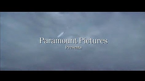
Titles for Forrest Gump:


T1: Paramount Production Company
3 seconds long


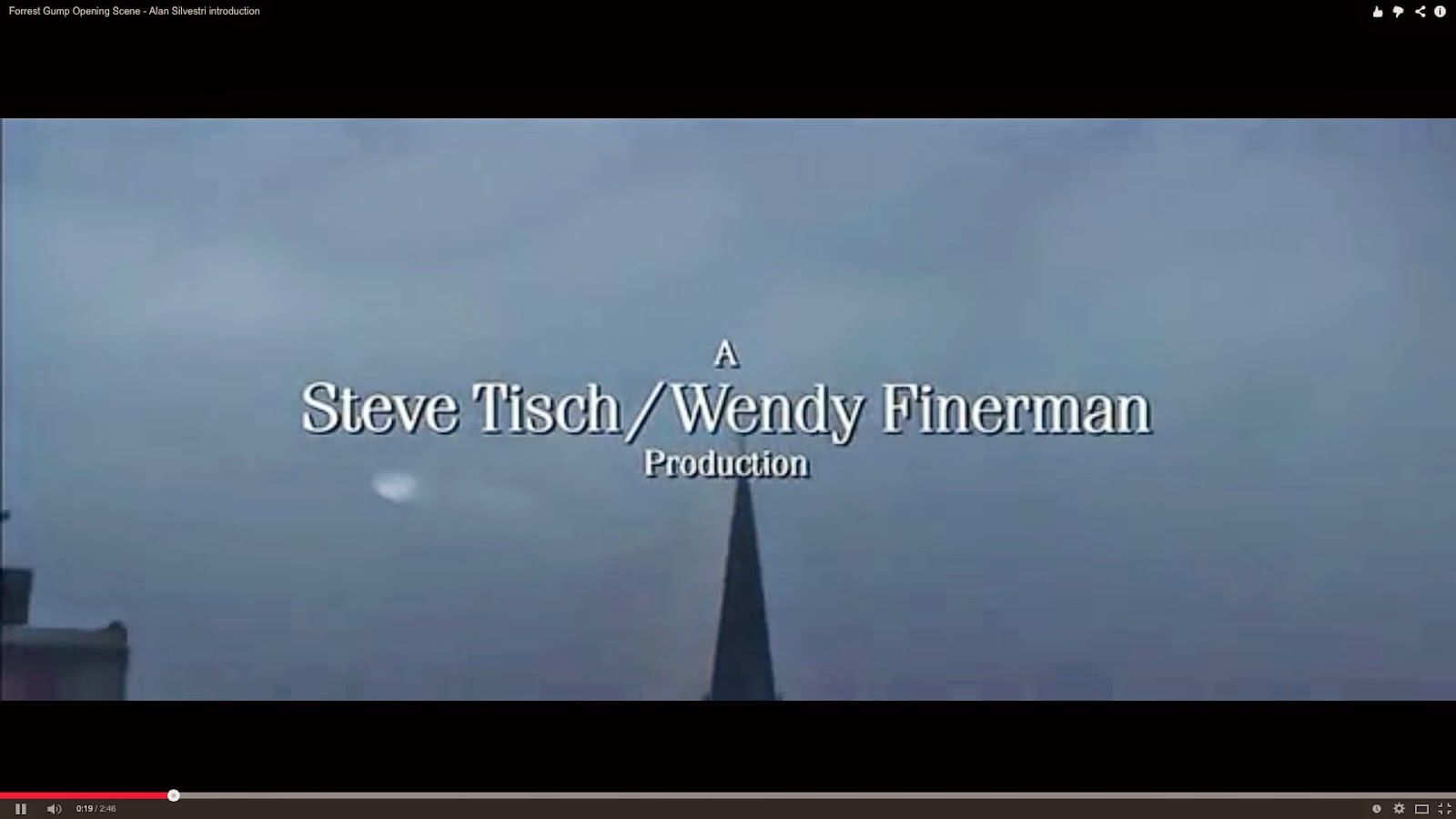
T2: More production companies.
3 seconds long


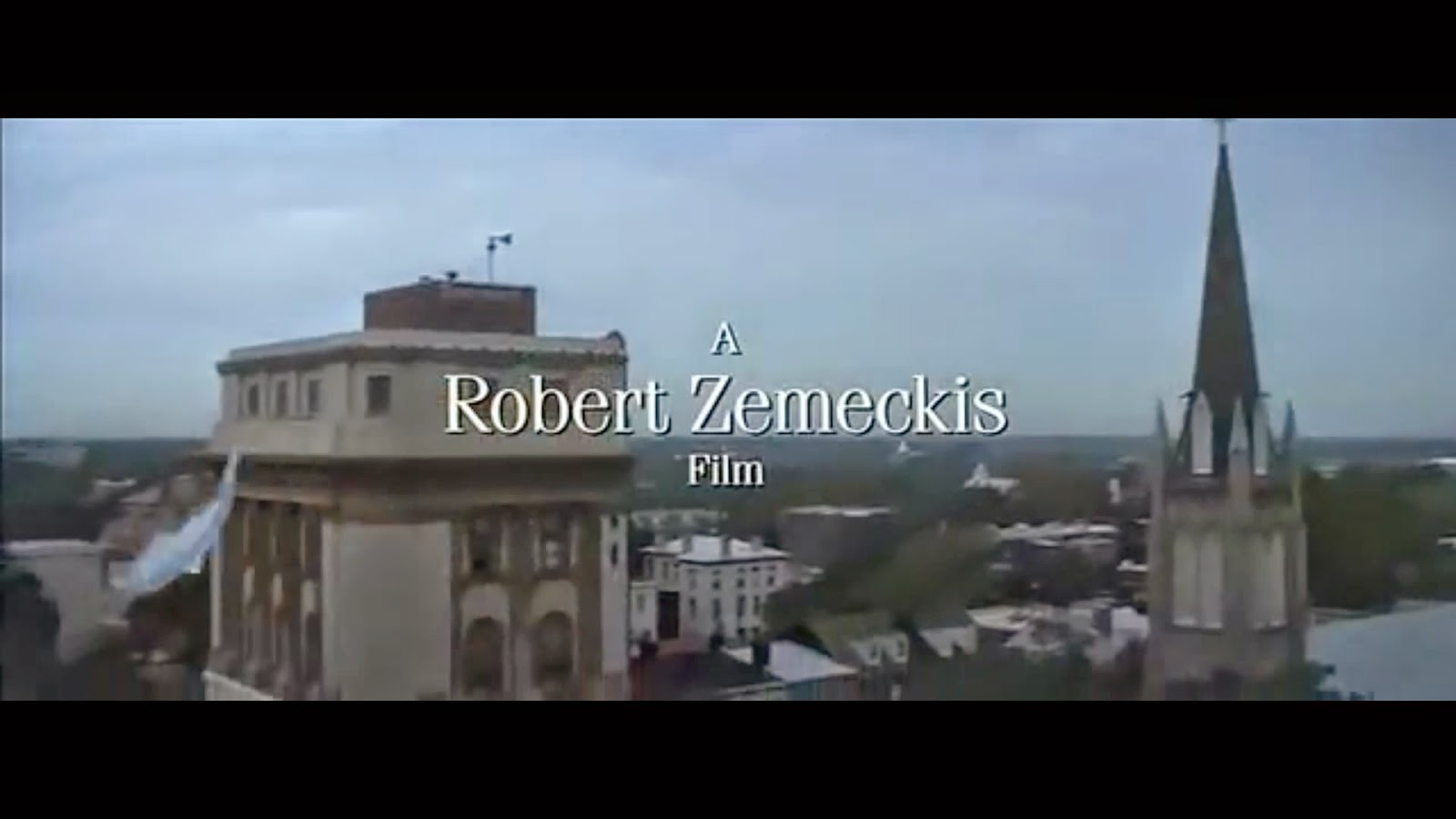
T3: Robert Zenick film.
3 seconds long


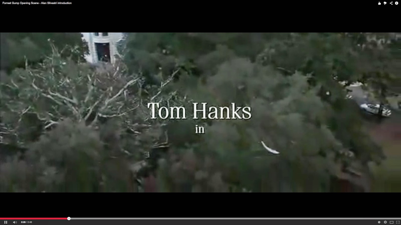
T4: Tom Hanks (actors introduced)
3 seconds long


T5: Forrest Gump. (Name of film)
3 seconds long


T6: Robin Wright, Gary Sinise, Mykelti Williamson and Sally Field (actors)
Each 3 seconds long


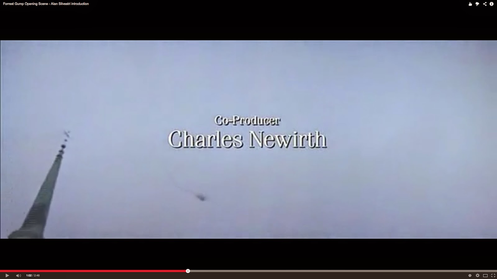
T7: Charles Newirth (co-producer)
3 seconds long


T8: Joe Sill (music producer)
3 seconds long


T9: Ken Ralston (Visual Effects Supervisor)
3 seconds long


T10: Joanna Johnston (costume design)
3 seconds long


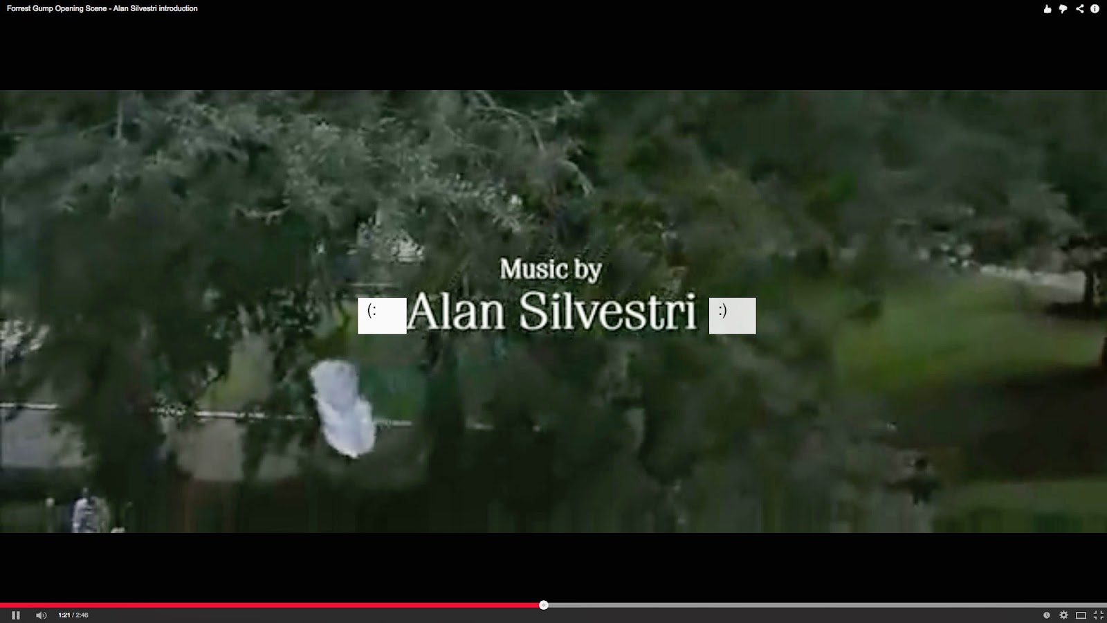
T11: Alan Silvestri (music)
3 seconds long


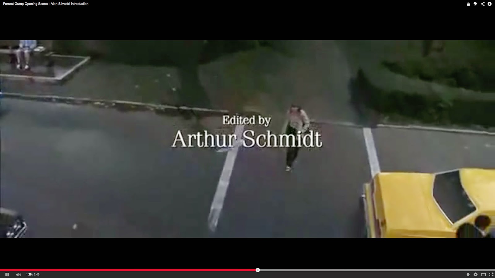
T12: Arthur Schmidt (editor)
3 seconds long


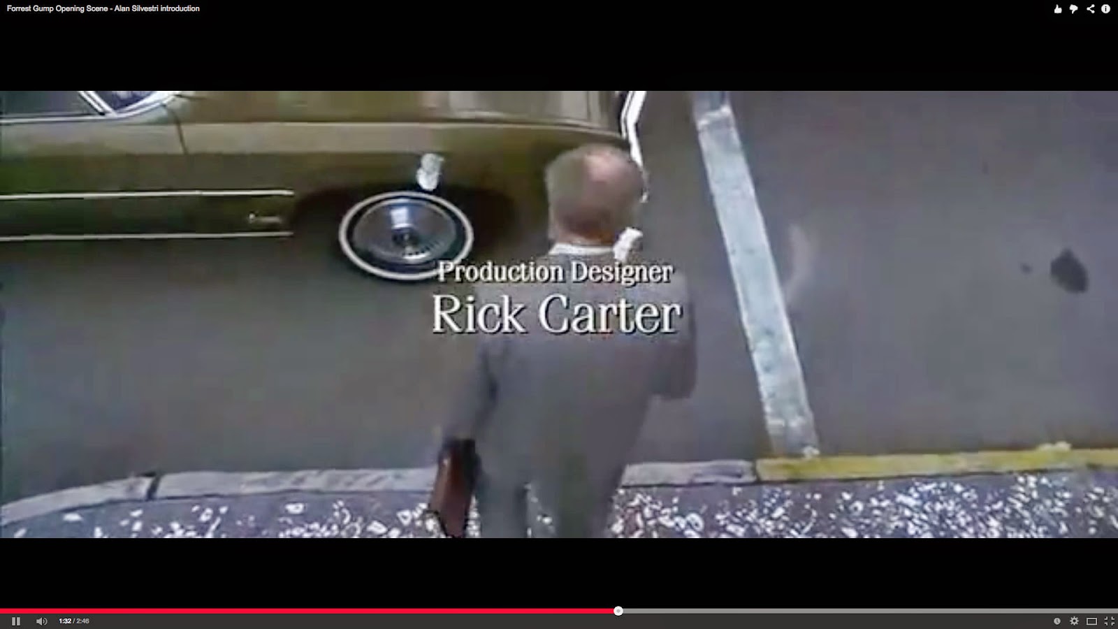
T13: Rick Carter (production designer)
3 seconds long


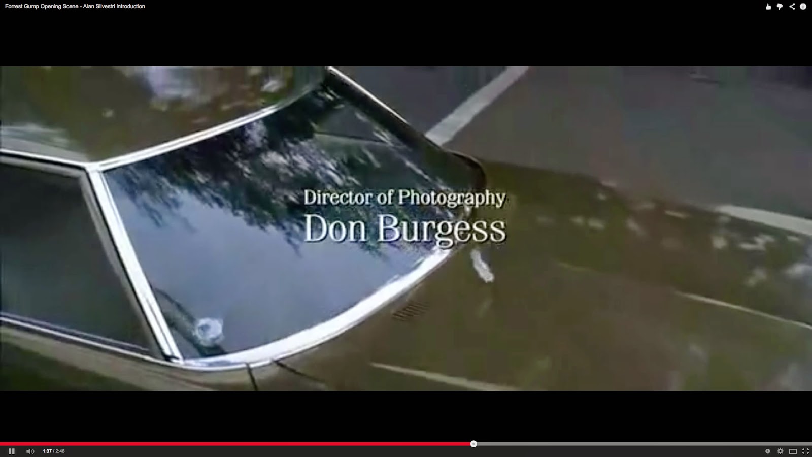
T14: Don Burgess (photography)
3 seconds long


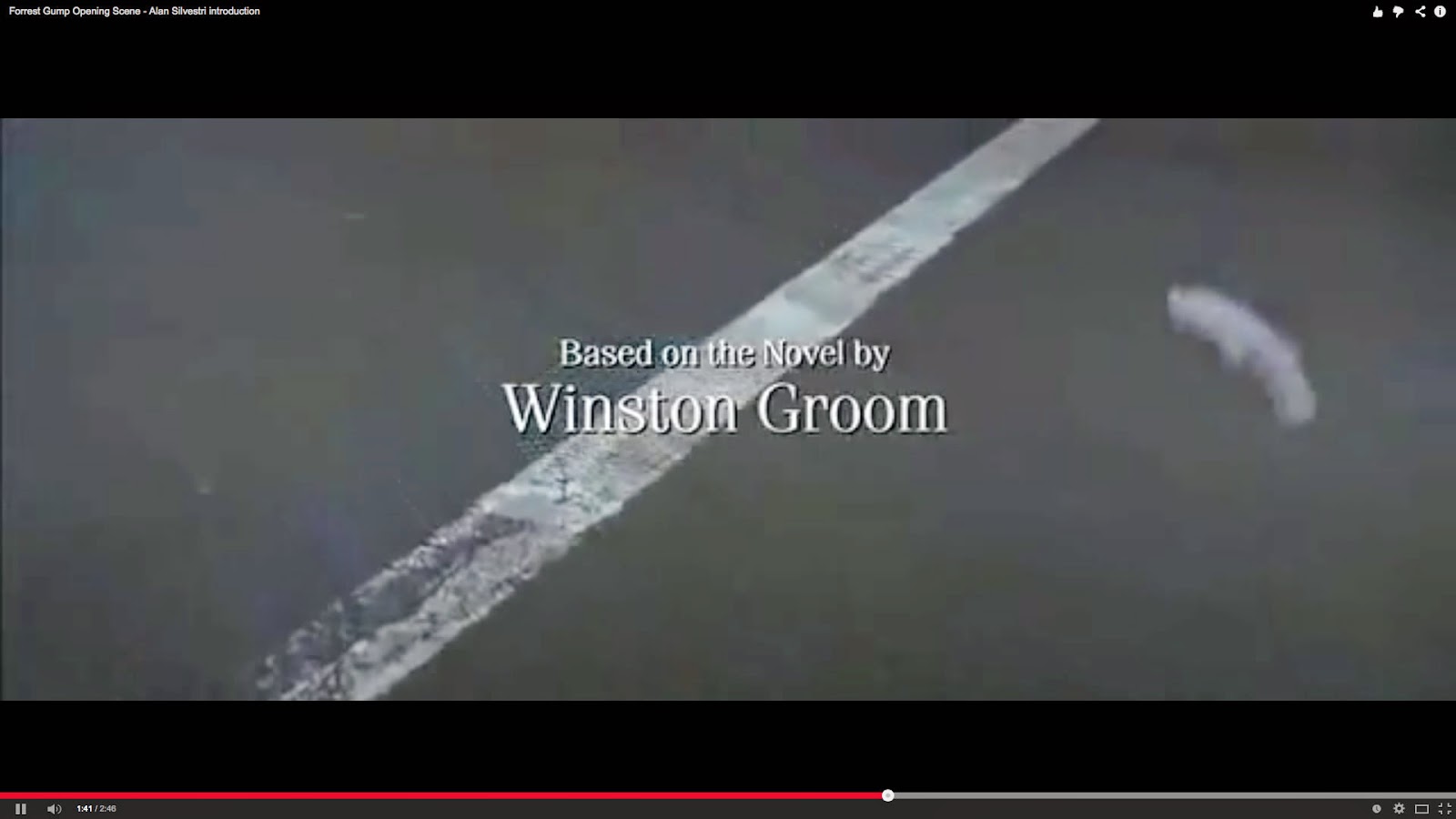
T15: Winston Groom (novel)
3 seconds long


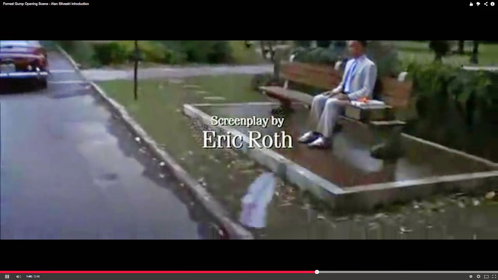
T16: Eric Roth (screenplay)
3 seconds long


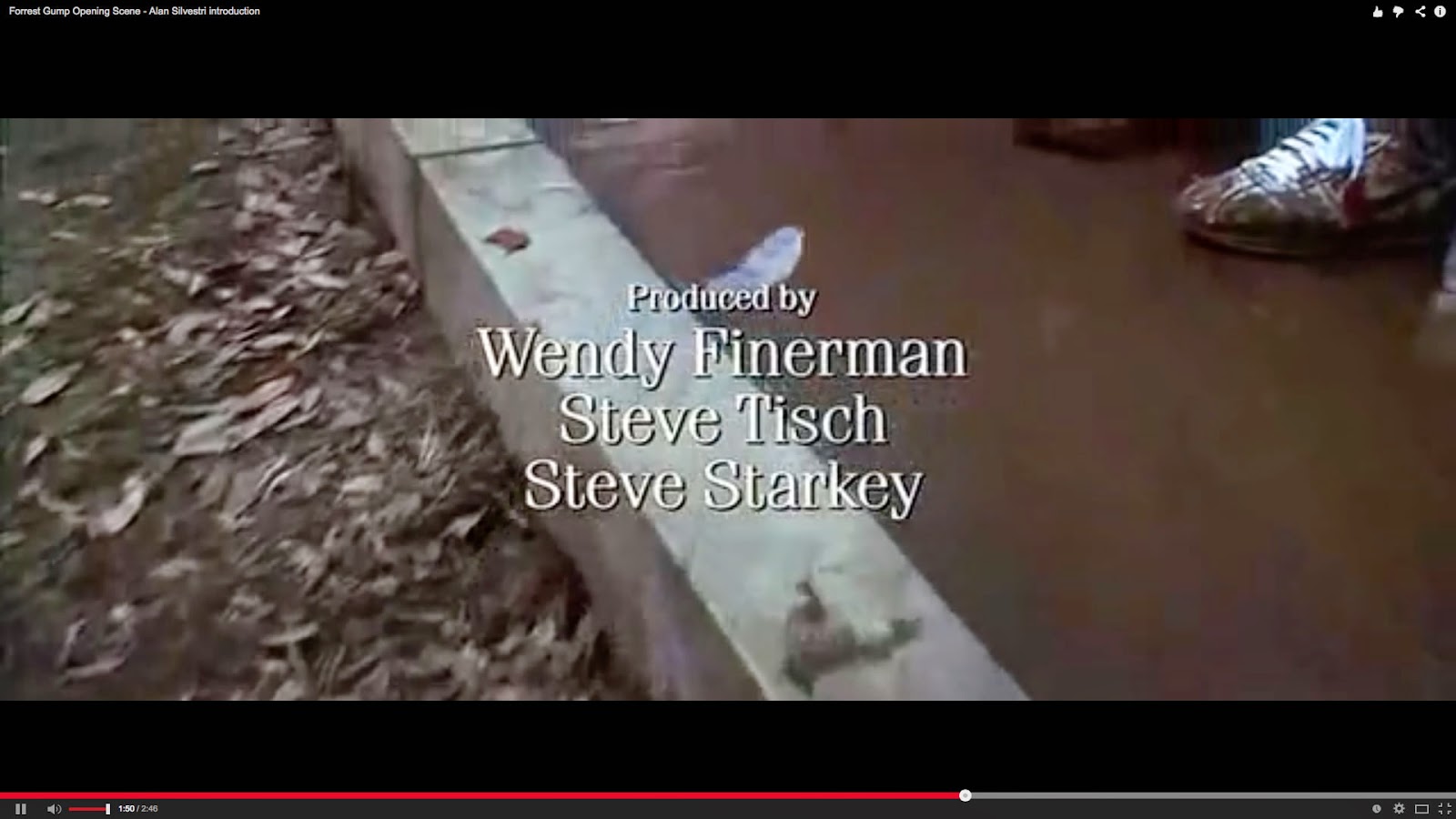
T17: Wendy Finerman, Steve Tisch and Steve Starkey (other producers)
3 seconds long


T18: Robert Zemeckis (director)
3 seconds long

 
THE CONJURING TITLES
 
 
T1: (DIRECTOR) 
Starts at 17 seconds, 4 seconds long
 
 
T2: (WRITTEN BY)
Starts at 24 seconds, 3 seconds long
 
 T3: (PRODUCERS) 
Starts at 28 seconds, 3 seconds long
 
 T4: (EXECUTIVE PRODUCERS)
Starts at 34 seconds, 3 seconds long
 
 T5: (DIRECTOR OF PHOTOGRAPHY)
Starts at 37 seconds, 4 seconds long
 
 T6: (PRODUCTION DESIGNER)
Starts at 44 seconds, 3 seconds long
 
 T7: (EDITOR)
Starts at 48 seconds, 3 seconds long
 
 T8: (ACTORS NAMES)
Starts at 1 minute 14 seconds, 4 seconds long
 
 T9: (MORE ACTORS)
Starts at 1 minute 18 seconds, 4 seconds long
 
 T10: (CASTING BY)
Starts at 1 minute 24 seconds, 4 seconds long
 
 T11: (COSTUMES)
Starts at 1 minute 25 seconds, 5 seconds long
 
 T12: (MUSIC)
Starts at 1 minute 35 seconds, 4 seconds long
 
 T13: (PRODUCTION/DISTRIBUTOR)
Starts at 1 minute 39 seconds, 4 seconds long
 
 T14: (PRODUCTION COMPANY)
Starts at 1 minute 45 seconds, 3 seconds long
 
 T15: (A JAMES WAN FILM)
Starts at 1 minute 49 seconds, 4 seconds long
 
 T16: (TITLE OF FILM)
Starts at 1 minute 56 seconds, 4 seconds long